Context
The redesign of the intranet portal for the Duke University business school: Fuquaworld.
This is a portal site that is important to the school’s functions. I used design exercises within a development team that had not done them before, with limited resources and timeframe constraints that were not always clear up front.
Students, faculty, and staff rely on a patchwork of online services to meet their needs within the school. In order to help direct the various audiences to the right services and to fill functional gaps with custom solutions a portal was created in 2003, which was primarily a table-based layout of links. In 2014 its outdated nature was apparent to all involved and students were requesting a more modern and mobile-friendly version.
My Role: UX Designer
I served as the designer on a team working closely with three developers who supported the project. My responsibilities were for UX research, interaction design, visual design, and responsive and accessible HTML/CSS.
While the project was a major part of my responsibility during my tenure on the team from 2014 – 2021, there were two major phases: 2014 – 2016 and 2019 – 2021.
Audiences
Students tend to be treated the most like customers in a traditional sense, as they are ultimately revenue-generating. They are at school full-time for two years, during which time they use many new systems, while managing challenging coursework and eventually searching for a new job.
Faculty are treated somewhat like celebrity content creators. Their time is protected by administration and staff, and interactions with them tend to depend on their individual personalities.
Staff tend to stay with the school for a long duration and their roles are specialized. They also have the least political influence, and are used to making-do with their situation in order to get their jobs done.
Discovery
- I performed stakeholder interviews to understand internal constraints and project history.
- I performed user interviews to understand usage of the site and challenges users faced.
I had been using the portal during my previous two years on the Marketing team, but I did not understand how others in the building used it. After initial discussions with the development team and IT stakeholders, I scheduled user interviews with users in diverse roles.
User interviews followed a set script and lasted about 30 minutes, during which I took notes as users performed prescribed tasks and provided some information about how they used the platform.
High-level takeaways:
- Most people used the site regularly to access three things: the internal directory, and two things pertaining to their job.
- A lack of hierarchy in design led to a situation where useful features remained unused due to lack of awareness.
- Usage of the site was habitual. Users learned where the items they needed were linked on the site, then ignored everything else.
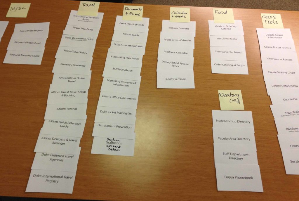
Card Sorting
After discovery, I performed card sorting with staff and students in order to better categorize content. I used an open sort method; letting participants create their own categories for grouping cards. This removed the guesswork from organizing content.
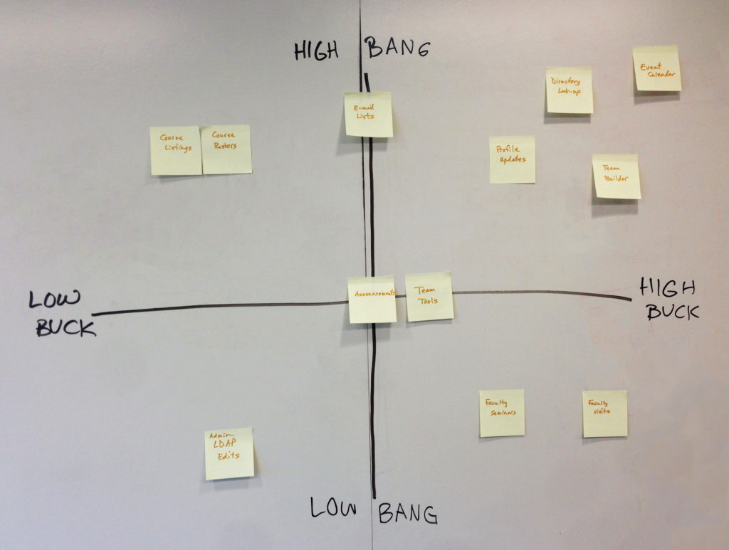
Feature Prioritization
Next, I worked with a developer on the team to determine the relative effort of important features. We discussed the complexity and importance of each feature based on our work, and a 2×2 grid of importance vs. difficulty, which presented a common understanding of feature priority.
Wireframing
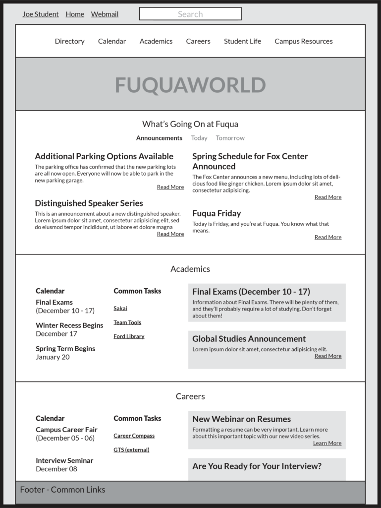
Low-fidelity wireframes were developed in InDesign based on discovery to help align visual and organizational direction given the significant departure from the existing site.
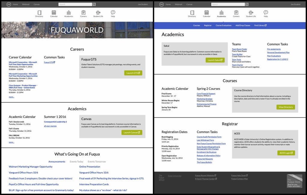
Students were the primarily-targeted user group given their reliance on the systems that FuquaWorld is intended to tie together, their short tenure at school (two years at most), and their central role in Fuqua’s mission. Throughout the process, students referenced a desire for FuquaWorld to be a “one-stop shop,” meaning that they wished it to be a central resource as much as possible. The student homepage was designed to bring the three most critical types of information students cared about to the top level: events, academics, and career information.
During this phase navigation was refined and the prototypes were quickly approved by students and development.
Prototype Testing
Remote usability tests were conducted in the summer of 2015 with a group of nine students using Skype and a static HTML/CSS prototype, which I designed and developed based on the wireframe.
Pages were laid out directly in HTML using a custom responsive template system. The prototype intentionally included minimal visual design elements and color, relying white space, grouping, and font size as the primary methods of giving priority and weight to elements in order to focus on information architecture and interactions/workflow. Each interview followed a script to keep them as consistent as possible.
The test was divided into two parts. The first part asked participants for general feedback regarding layout and organization of information. The second consisted of three tasks identified as high-risk based on uncertainty, importance or complexity: directory search, technical support documentation discovery and course directory navigation.
Unsurprisingly, given the major step forward relative to the existing outdated site feedback was overwhelmingly positive. High-level assumptions were validated, especially a desire for the site to be more usable on mobile platforms. Actionable feedback was weighted by number of participants which encountered or raised given issues.
Real-World Considerations
A major constraint was the annual class cycle, which limited the time we had available to work. Compromises were needed, so the prototype became the final design.
When students return in the fall and begin classes, developers are often tasked with supporting technology needed for coursework. Given this pressure along with the positive initial results from the prototype testing, the team decided to begin development as quickly as possible, which meant implementing the prototype UI in lieu of a proper design effort.
Initial Results
Even though the visual design phase was left out, the result was extremely successful. Students were very supportive of the new site, and were especially excited about a functional mobile interface.
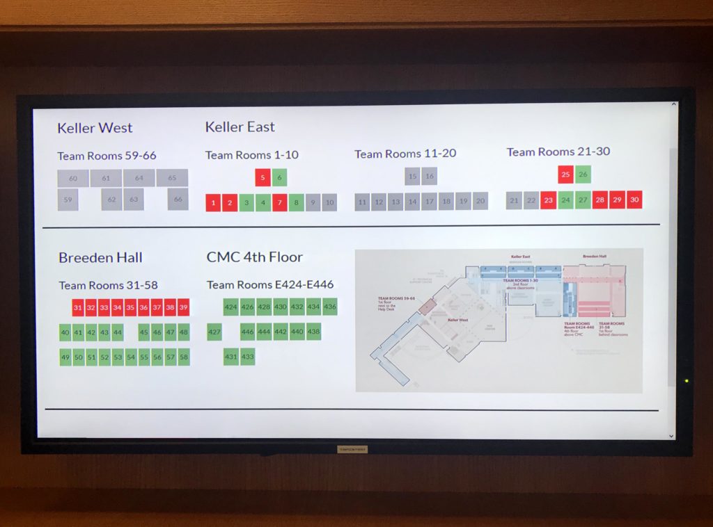
Team Room Finder
The Team Room Finder used motion detectors to determine when students were using dedicated study spaces. I designed a responsive layout that displayed real-time room availability on mobile, desktop, and television displays.
Of note, there was some dissatisfaction from a subset of staff that were long-term users of the old site. For them, the old site was kept around for an extended period as we addressed their individual concerns and let them adjust.
The effort of implementing the updated version of FuquaWorld took about two years, with a significant development push somewhere between six and twelve months.
Student Involvement
After two years there were no longer students enrolled who had used the previous iteration of the site, and those with an interest in tech began to do surveys of students and look for ways to improve the site, eventually proposing their own designs to faculty and staff.
While development of FuquaWorld never really stops given its central nature in the IT ecosystem, the design effort had been set aside for other priorities.
After the original students who had worked on the redesign left, it became clear current students felt it could be better. Initial feedback focused on the homepage, with students doing their own research and presenting their own ideas for how to improve it. There were a couple of key takeaways:
- The homepage should focus on specific links to important items instead of high-level categories.
- A serious visual design effort was needed.
Redesign
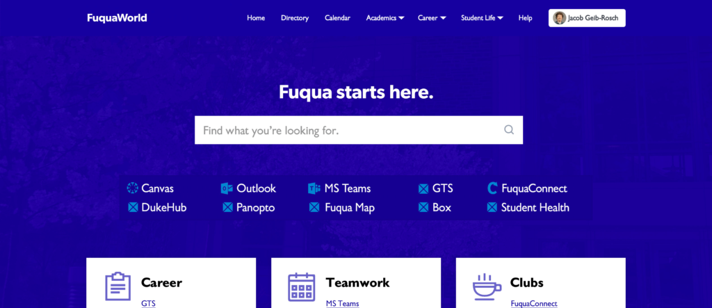
In early 2020 I created a visual redesign of the homepage using Photoshop that was based on the presented student feedback after discussion with the students.
The redesign raised the prominence of the search feature introduced in the previous iteration, which had been very successful. It also grouped links into more compact sections, allowing the scope of the content presented to increase.
Based on the initial comp, I redesigned the HTML/CSS of the site using flex and grid layout, and the site was moved further into being a true content management system, which included articles and microsite templates that would be centrally-searchable and housed within FuquaWorld.
Outcome
The user-centered design process I employed brought a new level of understanding of users’ needs into the IT department. Feedback for the new design was overwhelmingly positive, and a design framework was implemented that allowed for various departments to communicate their information to students more effectively and efficiently.
While student feedback in the first round of changes was quite positive, feedback was even more positive for the redesign effort even though much of the underlying technology remained the same.
This project was not just the largest project I’ve worked on in my career, but also the most impactful. Given the student response, as well as the IT team’s embrace of the learning gathered from user centered design practices, I feel confident that the platform—as well as the IT team—is in a fundamentally better place to serve student, faculty, and staff needs now and into the future.